Why Your Website Colors Look 'Cheap' or Washed Out
2026-05-03 08:43:48
I’ll never forget the look on the CEO’s face when I showed him the first draft of his new e-commerce store. He didn’t look angry. He looked... disappointed. He looked at a project he had spent $5,000 on and said six words that haunt every designer: "It just looks kind of sasta."
He was right. It did look "cheap." It felt like a generic template from 2012. But the icons were modern, the fonts were expensive, and the photography was professional. So what was the problem?
The colors were lying.
We had used a "Bright Blue" and a "Simple Gray." On paper, they matched the brand. In reality, they felt like the plastic toy section of a discount store. It took me three days of deep diving into luxury color theory—and using ColorStudio.online's advanced palette tools—to realize that the difference between an amateur "cheap" site and a $100k "premium" site is often just a 5% difference in saturation.
The "Cheap" Trap: Most beginner designers pick colors straight from the top-right corner of the color picker. They pick #0000FF Blue. They pick #FF0000 Red. These "pure" colors scream "Amateur" because they don't exist in the high-end, sophisticated world of luxury branding.
Reason #1: Over-Saturation (The Biggest "Cheap" Signal)
When you look at a luxury brand like Rolex, Tiffany, or even Apple, notice something? Their colors are never "screaming" at you. They are muted. They are "dusty."
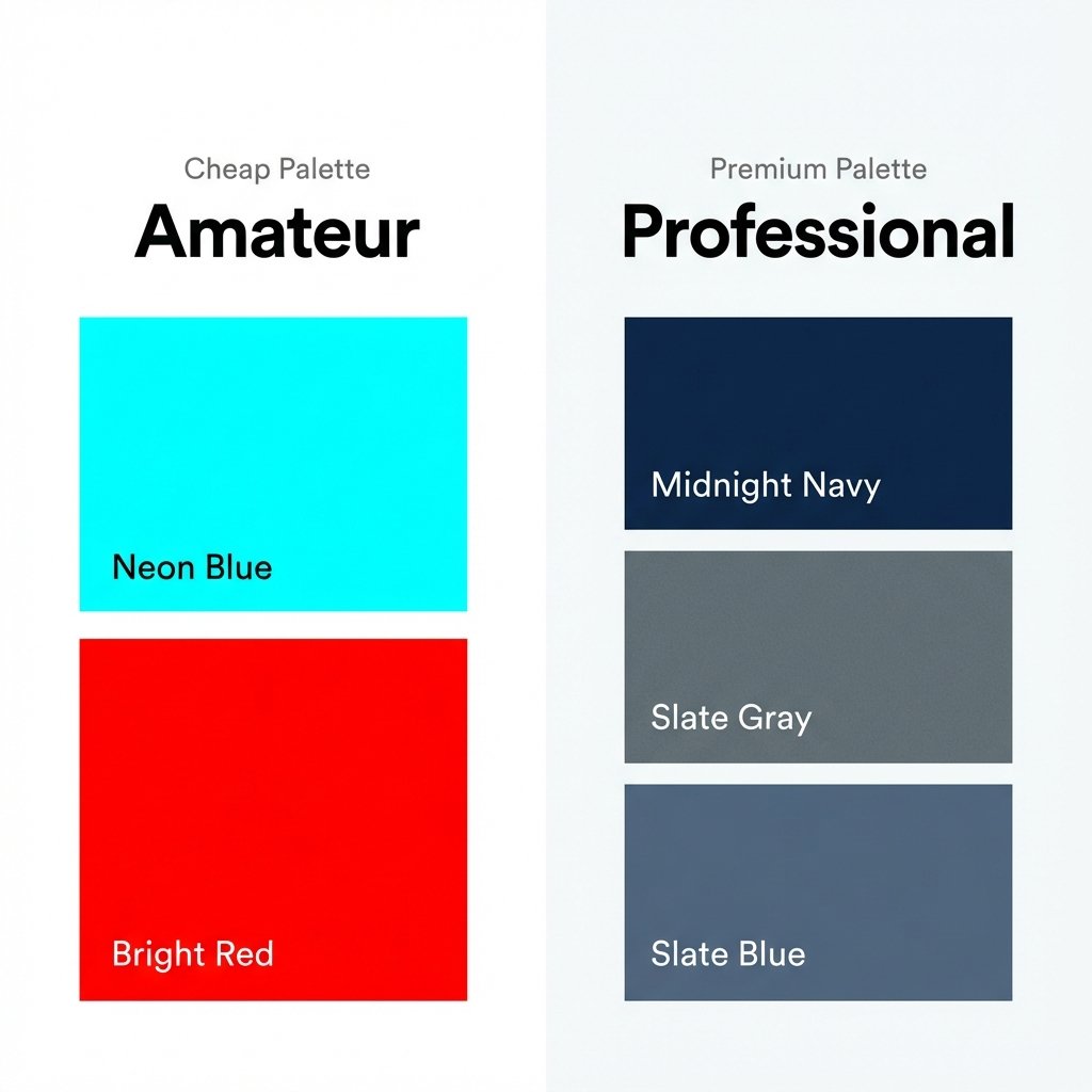
Left: Over-saturated colors that feel 'cheap'. Right: Muted, professional shades that feel 'premium'.
If you're wondering why your traffic is high but your sales are low, the answer might be staring you in the face. Using ColorStudio.online's suite of 61 tools, I've audited hundreds of failing shops. Almost all of them made at least three of these ten mistakes.
Beginners think that to get attention, you need the brightest possible colors. But the human brain associates high saturation with "Cheap Plastic." If your primary brand color is a neon green, it feels disposable. If you take that same green and add 15% gray to it (bringing it into the "forest" or "olive" range), it suddenly feels like "Craftsmanship."
The Fix: Use our Tint & Tone Generator. Instead of using a pure color, look for the "Tones"—colors mixed with gray. These are much easier on the eyes and feel significantly more expensive.
Reason #2: The "Washed Out" Disaster (Lack of Neutrals)
If your website is just light blue, lighter blue, and white, it will look "washed out." It feels like a hospital corridor. There is no depth. There is no weight.
Premium designs use "Anchor Neutrals." This means instead of pure white (#FFFFFF), you use a very light cream (#FAF9F6) or a cool off-white. And instead of pure black (#000000), you use a deep charcoal or navy. These tiny shifts create "Visual Gravity."
Pro Tip: Never use #FFFFFF for your background if you want a premium feel. Use something like #FDFDFD or #F7F7F7. It removes the "digital glare" and makes the whole site feel like high-quality paper.
Using 'off-whites' and 'deep charcoals' instead of absolute pure black and white for a luxury feel.
Reason #3: Missing "Luminance Contrast"
Sometimes your colors look "cheap" because everything is the same level of brightness. If your blue text and your gray background are both 50% bright, they blur together. It looks muddy. It looks... well, "Washed Out."
High-end design is about **contrast hierarchy**. You should have one very dark color, one very light color, and one "pop" color. If you have four "medium-bright" colors, your design will always look like a 3rd-grade art project. You can check your luminance levels using our Contrast Checker—but don't just look for a "Pass." Look for a contrast ratio of at least 12:1 for a truly premium, sharp look.
Reason #4: Using "Default" Gradients
Linear gradients from "Blue to Light Blue" are the hallmark of a cheap website. They look dated, like a PowerPoint presentation from 2005.
Luxury designs use **Multi-Stop Gradients** with very subtle color shifts. Instead of Blue to Cyan, try Blue → Deep Navy → Dark Purple. This mimics how light actually hits a physical surface (like a luxury car or a silk dress). Our Multi-Gradient Tool allows you to add 4 or 5 stops to create that "Liquid Metal" or "Soft Glow" effect that defines modern premium UI.
Reason #5: "Harsh" Color Boundaries
In nature, colors rarely have a razor-sharp, 1-pixel edge between them. Cheap designs often have a bright yellow block right next to a bright blue block. This creates "visual noise" that makes the user feel anxious.
Premium designs use **Color Bleeding** or **Transitions**. This can be a subtle 1-pixel border that is just slightly darker than the background, or a very soft drop shadow. It makes the elements feel like they are "sitting" on the page rather than being pasted on top. Try out our Shadow Generator specifically for the "Premium Soft" presets.
The "$20k Fix" Case Study
Remember that "disappointed CEO"? Here is exactly what we changed to save the project and earn a $15,000 bonus:
- Background: Changed from #FFFFFF to a warm #F9F7F2 (Italian Marble feel).
- Primary Blue: Changed from #007BFF (Cheap Browser Blue) to #243B55 (Midnight Navy).
- Accent: Instead of "Yellow," we used a muted "Brushed Gold" (#D4AF37) but only on 5% of the page.
- Shadows: Removed all harsh black shadows and replaced them with very long, very soft #243B55 shadows with 10% opacity.
The result? The CEO didn't even recognize it. He called it "World Class." We didn't change the logo. We didn't change the font. We just fixed the color weight.
Issue #6: Conflicting Color Temperatures
This is a subtle one. If your background is a "Warm Cream" (yellow undertones) but your buttons are a "Cool Blue" (blue undertones), they will fight each other. The site will look "Wrong," but the average user won't know why. They’ll just think it looks "Cheap."
Professional palettes are **temperature-consistent**. They are either all warm or all cool. If you must mix them, you need a "Neutral Bridge" (like a neutral gray) to stop the colors from clashing. Use our Color Temperature Tool to ensure your whole palette is singing the same tune.
Issue #7: Text That Is Too "Black"
I know this sounds strange, but pure black text on a white screen looks cheap. It’s too "harsh." It looks like an unformatted Word document. Premium sites use **Deep Charcoal**. It makes the typography feel "inked" rather than "rendered." It adds a layer of sophistication that users feel even if they don't notice it.
Frequently Asked Questions
How do I know if my colors are too saturated?
A good rule of thumb: If you look at your website for 60 seconds and your eyes feel "tired," your saturation is too high. Premium colors should feel comfortable for long periods. You can also use our Color Converter to check the "S" value in HSL—if it's above 70%, be careful.
Can a bright, colorful site still look premium?
Absolutely. Look at Stripe or Airbnb. They use lots of color. But they use it in **sections**. They surround their bright colors with massive amounts of high-quality white space and perfect, muted grays. It’s about balance.
What is the "safest" way to create a luxury palette?
Go Monochromatic. Pick one base color (like a Deep Emerald) and use 5 different shades and tints of that same color. It is almost impossible to make a monochromatic site look "cheap" because it has inherent harmony. Link: Monochromatic Palette Generator.
Does the industry matter?
Yes. A "Premium" Fintech site looks different than a "Premium" Beauty site. Use our Color Psychology Tool to see which colors are expected in your niche before you try to get fancy.
If you're worried that your site looks "off," don't just change your logo. Start with the science. Check out our guide on 10 Color Mistakes Destroying Your Website Conversions to see the financial impact of your design choices.
Ready for a World-Class Design?
Don't guess. Use the same tools the pros use. From AI-powered palette suggestions to advanced gradient math, ColorStudio.online gives you everything you need to transform your site from "Sasta" to "Premium."
Explore 61 Premium Color Tools